Execute Now: Build a Web Page
Today we’ll create a visible result with Claude Code. Let’s build a personal profile web page. One prompt is all it takes.
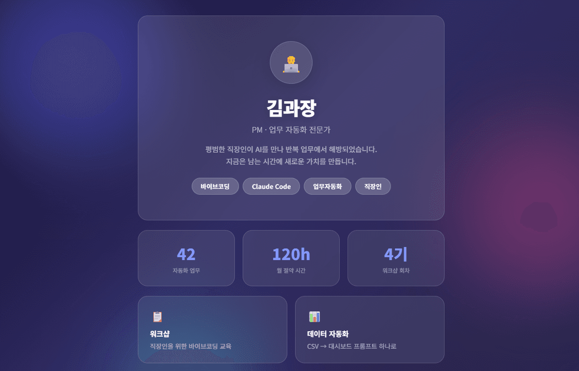
Create my profile web page.
Name: Manager Kim, Job: Work Automation Specialist
Modern and clean design,
dark theme with animations.
Save as index.html.
Given this single instruction, Claude Code handles everything automatically.
Dark theme colors, layout, font selection
Structure, styling, and animations in one file
Looks great on desktop, tablet, and mobile
Single index.html that opens directly in any browser
One prompt to a complete web page
From design to code to responsive layout — Claude Code does it all.
Double-click the generated index.html file to open it directly in your browser.
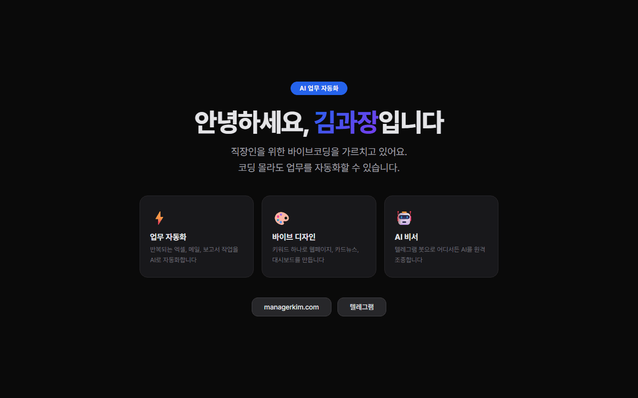
You’ll see a beautiful page like this. This is the start of vibe design.
Not happy with the result?
“Make the colors brighter,” “Add a profile photo section,” “Add scroll animations” — just say it and Claude fixes it immediately. Keep the conversation going until you get the result you want.
The Power of Design Keywords
The web page you just made looks decent, but nothing special, right? Add just one keyword and the result changes completely.
Design keywords are visual language that tell AI “make it feel like this.” Just like “americano” and “vanilla latte” are completely different drinks at a cafe, the same web page produces completely different results with different keywords.
Design Style Keywords
Neo Brutalism
Bold borders, primary colors, dramatic shadows. Strongly distinctive design
Glassmorphism
Translucent glass effect, blurred background, gradients. Futuristic feel
Bento Grid
Cards of various sizes arranged like a mosaic. Apple-style
Neumorphism
Soft 3D depth, pressed buttons. Premium feel
Aurora UI
Aurora-light gradients, glowing colors on dark backgrounds
UI Framework Keywords
Shadcn UI
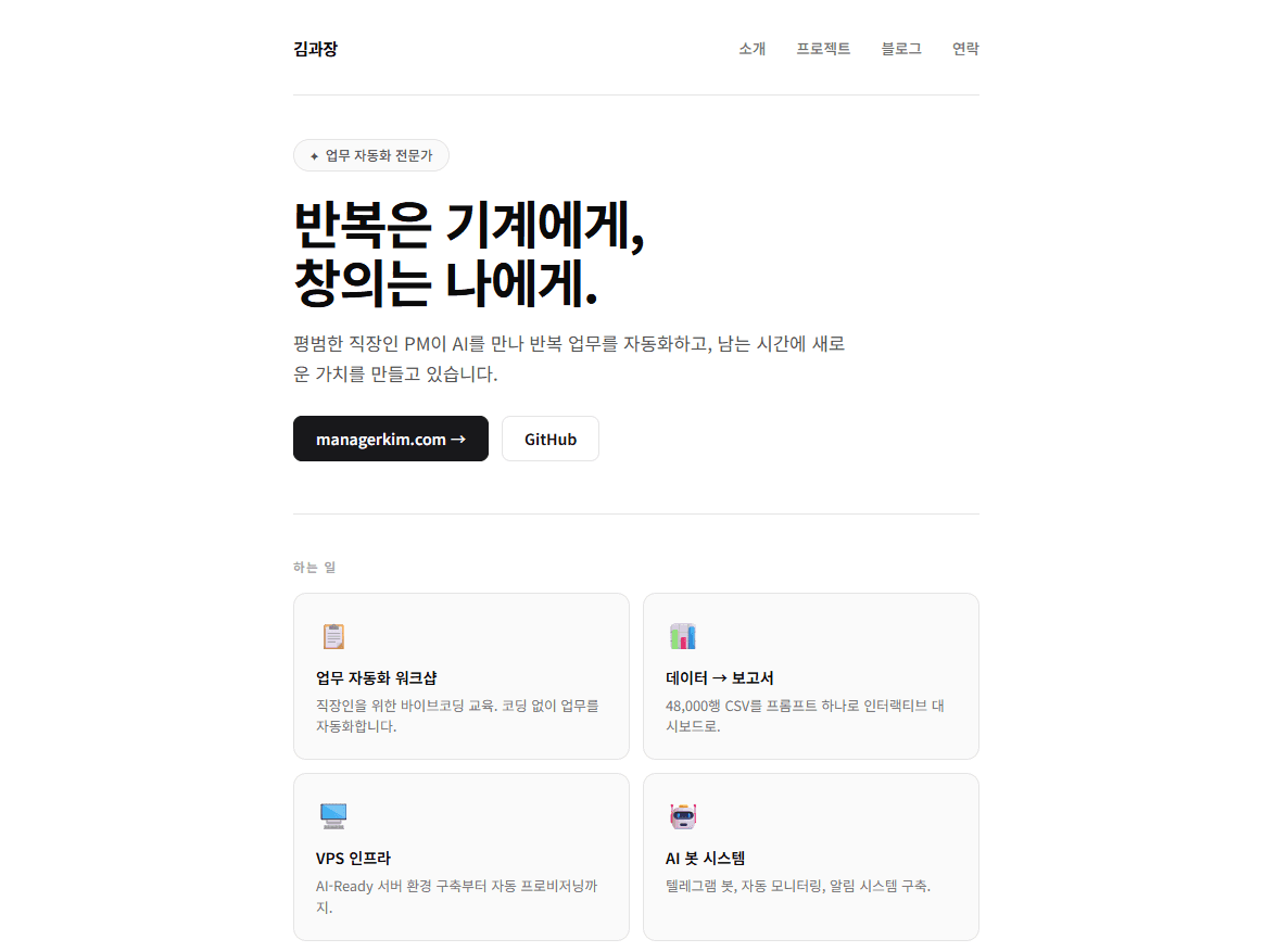
Minimal, monochrome, clean rounded corners. Developer-favorite style
Material Design
Google style. Cards, shadows, ripple effects
Tailwind UI
Practical and modern component design
Ant Design
Enterprise dashboard style. Data-centric UI
Chakra UI
Accessible, clean components. Flexible theming
Effect & Color Keywords
| Category | Keyword | Description |
|---|---|---|
| Effect | Parallax scroll | Background and foreground move at different speeds on scroll |
| Effect | Gradient mesh | Organic gradient backgrounds |
| Effect | Blur backdrop | Background blur for depth |
| Effect | Hover animation | Interactive motion on mouse hover |
| Color | Dark theme | Dark background, light text. Sleek feel |
| Color | Pastel palette | Soft pastel tones. Warm and friendly |
| Color | Monochrome | Single-tone palette. Minimal and focused |
| Color | Neon glow | Neon glowing effects. Cyberpunk vibes |
| Color | Earth tone | Natural colors. Stable and warm |
You don't need to memorize these
No need to memorize all these keywords. You can describe the feeling too. “Like Apple’s homepage,” “clean and premium,” “bold and colorful” — Claude interprets it. Knowing keywords just gets you more precise results.
One Keyword Makes This Much Difference
Same “create a profile web page” request, but changing just one design keyword completely transforms the result.
| Keyword | Result characteristics | Best suited for |
|---|---|---|
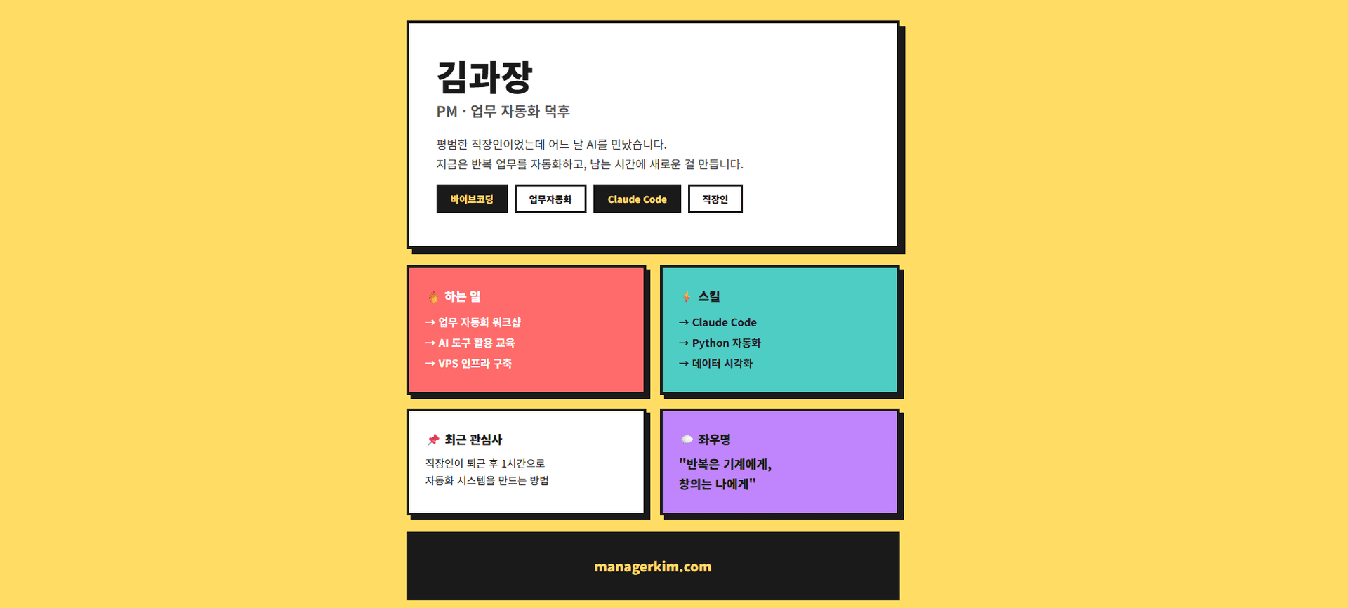
| Neo Brutalism | Bold black borders, primary color backgrounds, large offset shadows. Poster-like feel | Portfolios, creator pages |
| Bento Grid | Various-sized cards arranged mosaic-style. Apple product page feel | Skills/career showcase, dashboards |
| Shadcn UI | Minimal monochrome, clean rounded corners, restrained colors. Simple and professional | Developer profiles, corporate pages |
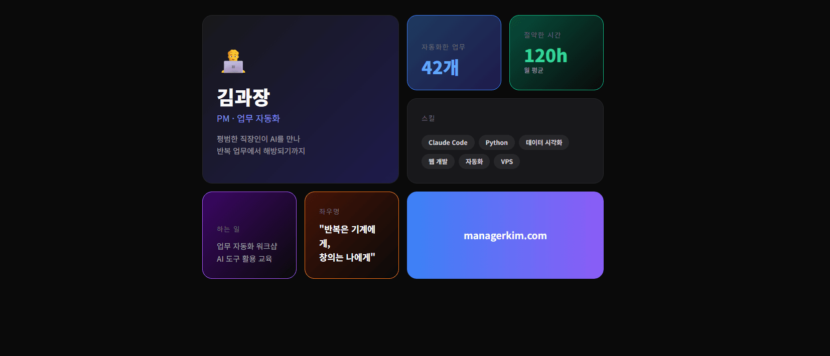
| Glassmorphism | Translucent glass cards, blurred backgrounds, soft gradients. Futuristic and refined | Designer profiles, event pages |
Actual Result Comparison
Compare Them Yourself
Try adding a keyword to the same request. See firsthand how completely the result changes.
Create my profile web page.Create my profile web page.
Neo Brutalism style,
with Parallax scroll effect.The first prompt gives a generic result, while the second produces a distinctive page with bold borders and primary colors, plus a parallax effect where the background moves independently on scroll.
Combining keywords is the key
Using one keyword works, but combining them yields even better results. Try mixing style + color + effect like “Glassmorphism + Dark theme + Hover animation.”
Figma → Code Conversion
If a designer created mockups in Figma, you can convert them into a working web page using Claude Code’s official Figma plugin.
Installing the Figma Plugin
claude plugin install figma@claude-plugins-officialAfter installation, connect authentication inside Claude Code.
/mcp
→ Select figma → Authenticate → Allow Access
→ Confirm "Authentication successful"
Usage
Implement this Figma design as HTML.
URL: figma.com/design/abc123...
Pixel-perfect, make it responsive.
Claude Code reads the Figma file’s layers, colors, fonts, and spacing, then converts it to code. You can also use the /implement-design command.
| Command | Function |
|---|---|
| /implement-design | Figma frame → code conversion |
| /create-design-system-rules | Generate team development guidelines |
| /code-connect-components | Map Figma components ↔ code components |
Works with Figma free plan
Previously, Dev Mode (paid) was required, but the official plugin can read basic design data even on Figma’s free plan. However, advanced features (Code Connect, etc.) require Professional or above.
Figma Plugin vs Pencil.dev
There are two tools for connecting design and code with AI.
| Feature | Figma Plugin | Pencil.dev |
|---|---|---|
| Direction | Design → Code + Code → Design | Design ↔ Code (fully bidirectional) |
| Environment | Claude Code + Figma app | Built-in canvas inside Cursor IDE |
| Installation | claude plugin install figma | Cursor marketplace |
| Price | Plugin free (Figma account required) | Free early access |
| Strength | Anthropic official, designer collaboration | Full code-design synchronization |
Neither is required
You can create designs with Claude Code even without Figma or Pencil.dev. The design keywords we learned earlier are more than enough for impressive results. Add tools later when you need them.
Card News & Detail Pages
A truly practical application of vibe design—creatingcard news and detail pages. Instagram posts, blog graphics, e-commerce detail pages—all possible.
Creating Card News
Create card news on "5 Ways to Save Time With AI at Work".

- 5-card HTML
- Instagram square ratio (1080x1080)
- Each card: number, title, description, icon
- Bright gradient backgrounds
- Last card: CTA (follow prompt)
Save as index.html.
Claude Code creates a 5-card set as HTML. Open it in a browser, screenshot each card, and post to Instagram.
Creating a Detail Page
Create a mobile detail page.

Product: AI Work Automation Workshop
Price: $25
Details: 3-hour hands-on, beginners welcome, small class

- Mobile optimized (390px width base)
- Vertical scroll layout
- Hero image area at top
- 3 feature cards
- Testimonials section
- Fixed CTA button at bottom
Save as detail.html.
E-commerce or class sales detail pages are done with a single prompt. No designer needed, no Canva needed—Claude Code handles everything.
Screenshot tip
Want to convert the HTML to an image? Tell Claude Code “take a screenshot of this HTML with Playwright.” The Playwright installed in Step 4 comes in handy here.
Try It Yourself
Pick one of the missions below and build it yourself. The more keywords you combine, the more interesting the results.
Mission 1: Your Own Profile Page
Create my profile web page.
Name: [your name], Job: [your job]
[your favorite keyword] style,
with animations.
Keyword suggestions: Glassmorphism, Bento Grid, Neo Brutalism, Aurora UI
Mission 2: Card News on Your Topic
Create 5-card news on "[your interest] beginner's guide".
Instagram square ratio, Pastel palette.
Examples: investing, language learning, cooking, fitness, travel—anything works
Mission 3: Iterate to Polish
After completing Mission 1 or 2, try requesting revisions like these.
Make the colors warmer.
Add a profile photo area.
Make the font more rounded.
Add a contact section at the bottom.
It doesn’t have to be perfect the first time. Evolving through conversation is vibe design.
Errors are fine. Tell Claude Code “there’s an error, fix it” and it resolves automatically. If the result looks off, say “make it more polished.”
Verification Checklist
Design Prompt Tips
Here are tips for using design keywords effectively. Remember these and your prompt skills will level up dramatically.
1. Show references
“Like Apple’s homepage,” “Clean like Notion,” “Toss app style” — mentioning well-known services as references helps Claude accurately understand the style.
2. Provide specific numbers
Instead of “big text,” say “title 48px, body 16px.” Instead of “lots of whitespace,” say “section spacing 80px.” Specific numbers dramatically improve accuracy.
3. Mention what you DON’T want too
“No gradients,” “keep animations subtle,” “no red” — clearly stating what you don’t want reduces unnecessary revision rounds.
4. Request in stages
Don’t try to request everything at once. “Set up the basic layout first” → “Apply colors” → “Add animations” — building step by step lets you adjust direction at each stage.
The ultimate tip
The best way to improve your prompts is trying lots of them. Make 3–4 versions of the same topic with different keywords. Once you develop a feel for which keywords produce which results, you can precisely create any design you want.
References
- Figma Plugin — claude.com/plugins/figma
- Pencil.dev — pencil.dev