Automated News Report Generation
How much time do you spend every morning searching, reading, and organizing industry news? Usually 30 minutes to an hour. Have Claude Code do it and it’s done in 2 minutes.
Search for today's AI-related news,
pick the top 5 stories,
and create a summary report as report.html.
Use a nice card layout.
This one command is all Claude Code needs:
Uses Playwright to browse news sites and collect articles
AI picks based on importance, trending topics, and relevance
Creates a clean report with titles, summaries, and source links
Open the generated report.html in your browser and you’ll see a beautifully organized news report in card layout. Share it before a team meeting and you’ll get asked “how did you make this?”
Not just news
Use the same approach for industry trend reports, competitor analysis, and market research. Just change the “today’s AI news” part. Example: “Research semiconductor industry trends from the past week and create a report”
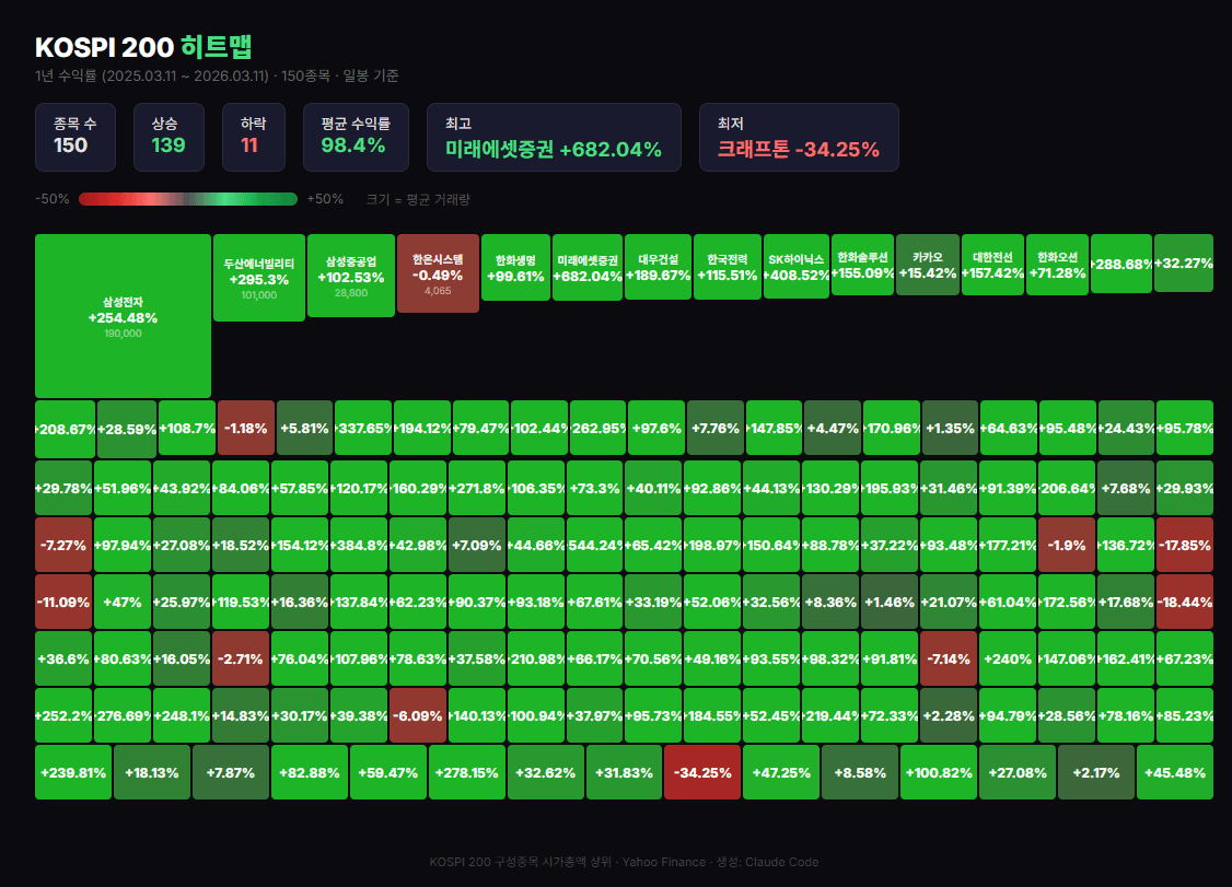
CSV → Heatmap Dashboard
Got Excel or CSV data? Claude Code turns it into an interactive dashboard. No code needed—just one sentence.
Read kospi200_stocks_daily.csv,
calculate 1-year returns by stock,
and create a Finviz-style heatmap dashboard
as HTML. Show charts on hover.
Here’s what Claude Code does, step by step:
| Step | What Claude does |
|---|---|
| Read data | Analyzes 48,000 rows of CSV and groups by stock |
| Calculate returns | Computes return rate from starting price vs. current price for each stock |
| Generate heatmap | Color-codes green (gain) to red (loss) by return rate |
| Add interactivity | Shows stock name, return rate, and mini-chart on mouse hover |
| Save as HTML | Single HTML file with no external library dependencies |
The output is a single HTML file. 48,000 rows of data transformed into a single dashboard. Open it in any browser, and share it with anyone as a single file.
Not just stock data
Any CSV-format data can be visualized.Company revenue data, HR data,customer data — as long as it’s CSV, Claude Code analyzes it automatically.
48,000 rows into a single dashboard
One prompt line transforms an Excel file into an interactive visualization
DART-Integrated Investment Briefing
Let’s take the heatmap one step further. Combine DART disclosure data with stock price data to receive an automatic daily investment briefing every morning.
Heatmap Overview
See returns for 150 stocks at a glance. Which sectors are up, which stocks surged or dropped— instantly visible by color.
DART Disclosure Collection
Automatically collects the latest disclosures for your watchlist stocks. Earnings reports, major contracts, executive changes— never miss investment-moving information.
AI Insights
Analyzes disclosures alongside stock price movements. Generates insights like “Samsung Electronics stock up 3% after earnings, revenue exceeded market expectations by 10%.”
Auto Delivery
Sends the completed briefing to Telegram every morning automatically. Read it on the subway before work and you’re caught up on the market.
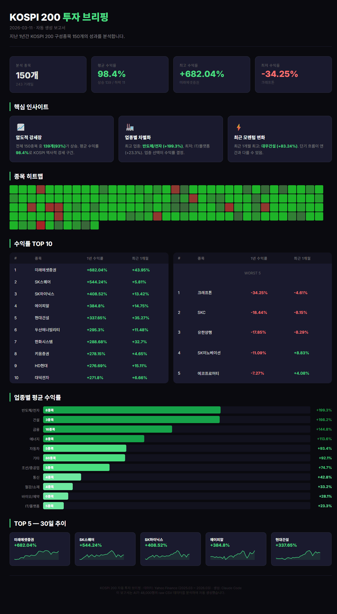
Using DART OpenAPI (key: your-api-key-here),
fetch recent disclosures for Samsung Electronics,
SK Hynix, and LG Energy Solution,
combine with stock price data,
and create an investment briefing HTML.
The DART OpenAPI is available for free. It’s a public API that lets you programmatically access disclosure data for all Korean listed companies.
API key management
Your DART API key is personal. Rather than putting it directly in code, manage it via environment variables or a separate file for safety. Tell Claude Code “save the API key in .env and read it from there” and it handles the setup.
Taking It Further
Once you’ve created a report, that’s not the end. The same data and analysis can be transformed into multiple formats. That’s the real power of agentic AI.
1. Convert to PPT
Convert report.md into a PPT.
Include charts, 5-slide layout.
Turn an analysis report directly into presentation slides. 5 minutes before a team meeting and your PPT is ready.
2. Convert to Web Dashboard
Turn these analysis results into
a web page with charts.
Include bar charts, pie charts, and trend lines.
Creates an interactive dashboard as a single HTML file. Opens directly in any browser and is easy to share internally.
3. Auto Email Delivery
Send this summary to my manager by email.
Subject: "Daily Market Briefing".
With Gmail integration set up, report generation through email delivery happens in one shot.
Chain expansion is the key
Once you create one thing, it chain-expands.CSV → Analysis → HTML report → PPT → Email delivery. You don’t do each step separately— just continue the conversation: “now make a PPT from this,” “now email this.”
Try It Yourself
Pick one exercise below and try it. Nothing difficult—just copy-paste the prompt.
Challenge 1: News Report
Pick a topic you’re interested in and create an AI news report.
Search for the latest news on [your topic],
pick the top 5 stories, and create a summary report
as report.html
Challenge 2: Data Visualization
If you have an Excel or CSV file, turn it into a chart. If not, ask Claude Code to create sample data.
Create monthly revenue sample data
and build a dashboard with bar charts
and trend lines as HTML
Challenge 3: Report Conversion
If you already have a report, convert it to another format.
Convert the report.html I just made
into a PPT. 5 slides,
include charts.Don’t worry at all about errors. Tell Claude Code “there’s an error, fix it” and it analyzes and tries another approach. That’s the real charm of agentic AI.
Data Visualization Tips
Remember these four things when visualizing data and your output quality jumps dramatically.
Prepare data as CSV
Large datasets work best in CSV format. In Excel, go to “Save As → CSV” and you’re done. Claude Code reads CSV most accurately.
Specify the output format
“Create a report” is much weaker than “create it as HTML.”Be explicit about whether you want HTML, PPT, or PDF. More specific formats yield better results.
Mention reference sites
“Finviz style,” “like a Bloomberg dashboard” —mentioning reference sites dramatically improves design quality. Claude Code references the style to build accordingly.
Specify chart types
“Add charts” is weaker than “bar chart,” “pie chart,” “heatmap,” “sparklines” — be specific to get the results you want.
| Saying this | Saying this is better |
|---|---|
| “Visualize the data” | “Visualize monthly revenue as a bar chart and save as HTML” |
| “Create a report” | “Create an HTML report with card layout” |
| “Make it pretty” | “Create a Finviz-style heatmap” |
| “Add charts” | “Include bar chart + trend line + pie chart” |
Data visualization = highest-impact automation
Turn a spreadsheet full of numbers into a single dashboard and everyone asks “wow, how did you make this?” It’s the automation that delivers the biggest impact with the least effort. One prompt line is all it takes.
References
- SWE-bench — swebench.com
- Finviz — finviz.com